Google's new Font Directory is a Disaster
Thu, May 20, 2010
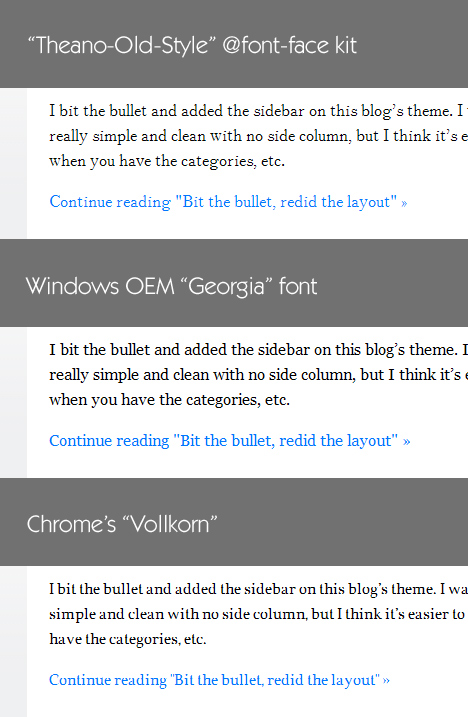
Yesterday, Google released the Google Font Directory: A list of free fonts that can be embedded and used directly from their site. It's a promising service and a good boost for fonts on the web. However, I wanted to try to use one of the fonts for this blog and the results were pretty surprising. I've used @font-face fonts before and mostly by downloading an @font-face kit from FontSquirrel. They have support for all browsers through SVG and multiple font formats (which I'm not sure the Google Font Directory has) and using the fonts generally works flawlessly. I mashed together an image that displays how this blog's text gets rendered using the OEM distributed "Georgia" font (which is currently used on this blog), [Google's Vollkorn]((I'm using Chrome on windows, I don't know if it's a browser issue, but it looks the same in Chrome and FF 3.6 on my screen.)) and a similar font, called "Theano Old Style" from FontSquirrel:  As you can see, Google's Vollkorn looks absolutely terrible. It is a complete disaster, from a design point of view. I don't know if it's something to do with the font or the way the font gets rendered by this browser, but it looks as if this is something that *really* needs to be fixed if anybody is supposed to be able to use the font. I want to note that the Font Directory itself is a great idea and the interface for adding and finding fonts is dead simple, even though I don't have a clue how the expect to make money from this or why they wanted to create the directory in the first place. Edit: Some people have told me that the article is missing what machine/browser etc I'm using to get the results. I'm using Windows XP and the fonts render the same way in both Firefox 3.6.3 and Chrome 5.0.375.38 beta. One other thing: This only applies to the fonts when you use them in smaller font sizes. As soon as the font becomes bigger, it's much less of an issue, but in order to use the font for reading-text, this would have to be fixed. Edit2: This seems to only be an issue with Windows based machines. On both Linux and Apple, people have reported that the font looks very smooth. And indeed it does: Screenshot from Safari