Mobile app design: Clutter free using 1% prominence.
Sat, Apr 13, 2013
By now, it's no secret that making mobile products has a unique set of design challenges. All companies and individuals making mobile products struggle with this. Finding the right balance between power and ease of use on a 3" - 4" screen is hard.

It really all boils down to the natural rule of features: More features => harder to understand, more useful. Fewer features => easier to understand, less useful. So if you just add more features, without applying careful thinking about the whole experience and especially the experience for new users, you'll inevitably make a complicated product.
Stating the problem
You want your product to be powerful. The more powerful it is, the more useful it is for your users. Contradicting this fact is that the more powerful the product is, the harder it is for your new users to understand what's going on. So you have to somehow figure out a way to retain these powerful features without adding way too much stuff into your app. Reducing the number of buttons, options, controls and states, without removing the features that make your app more useful for the users who have already started using your app regularly and want more customizability and flexibility.
Prominence
The solution to adding more features without hurting the experience generally involves tweaking prominence. Examples of tweaking prominence:
- Making things smaller
- Using icons instead of text
- Camouflaging (Reducing contrast)
- Siloing (Moving to a menu or a different screen)
On traditional web apps you can even do things like moving actions into a hover state of elements. A great example of that is Twitter's hover-to-reveal the buttons in the twitter feed:

Upping your game. 1% prominence
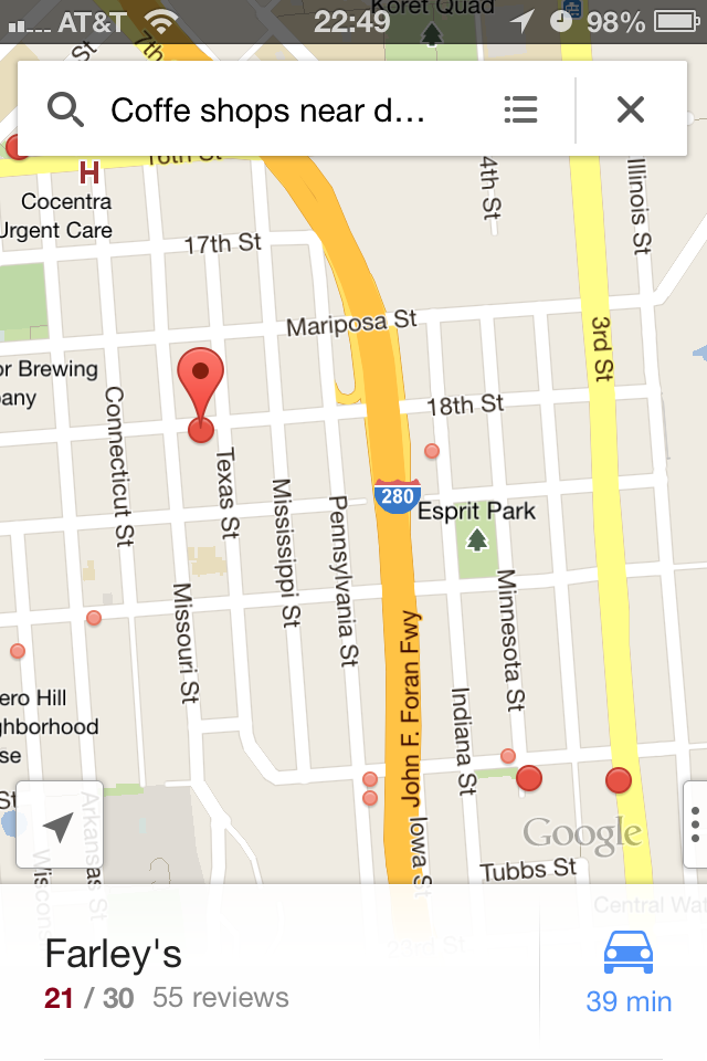
The best and most efficient, most novel approach to reducing prominence is to not have any visual indication of a feature at all. 1% prominence. Some such actions are pretty well known. On iOS you can tap and hold to do a Harlem Shake and move, categorize and remove apps. Another one is how you can tap on statusbar when there is a scrolling view to scroll to the top. These are some less known examples of 1% prominence which prove as great examples: Double tap and hold to zoom: An example of 1% prominence is in the iOS version of Google Maps. To zoom in or out in gradual steps at your own speed, you double tap and hold the second tap on your map, and now you can move your finger up or down to zoom in or out. They could have added a slider or a button into the UI to make this more obvious, but really it's the kind of thing that easily clutters up the UI and makes it so the product seems more complicated. Swiping to jump between search results: Google Maps has added multiple such interactions in the app. Another example is when doing a search, you can swipe the first result on the bottom of the screen from left to right to view the other search results and have them highlighted on the map. Again, really hard to find, but useful once you're accustomed to the product.

Tapping to add text: When you take a photo in snapchat, you add text to the photo by tapping on the preview/editing area. New users might not be helped through taking their first photo by having more buttons, but it's nice for users who have already started using your app to give them more editing options.

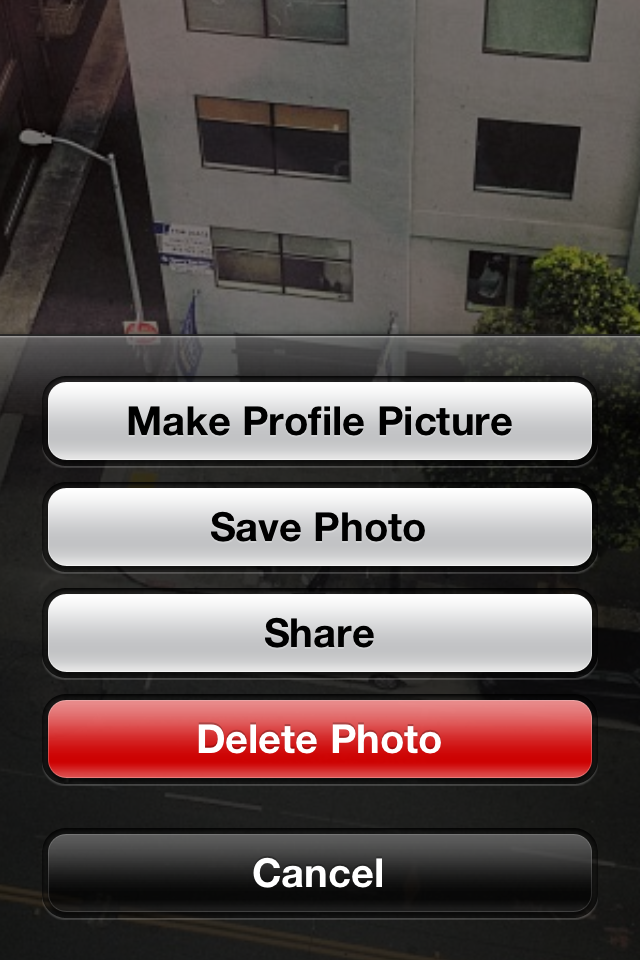
Tap and hold to reveal more options: When you view a photo in Facebook, you can actually tap and hold the photo to reveal some uncommon options like flagging a photo, deleting it, sharing etc. Not very helpful for 99% of the use cases, but when you want to figure out how to perform any of these actions you might try a bunch and find this feature. Again, nice when you need it but probably not if it was an extra button to cutter up the UI for users who have just started using the app.

Going too far
Sometimes you can go too far in reducing the prominence of a feature. Anybody who has tried logging out of their Twitter account on iOS probably has experienced this. In order to log out you actually have to do the following: Go to your "me" tab, click on the account icon, pressing edit on the bottom of the screen, which turns your account list into an editable list where you can "remove" your account.

I assume they found that people didn't commonly know their password if they logged out. Great example of 1% prominence but not very user aligned.
Conclusion
You have to find novel ways of adding more features without it affecting the user experience for new users or users who have not used a particular feature before. The new users are the ones that eventually turn into engaged users, so retaining them is a necessary first step and should be the main priority. Do you know of other examples? Let me know in the comments.